安卓速通(其实是期末复习~)(第一章+第二章)
ZealSinger 发布于 阅读:1028 期末复习
Android简介和基础信息
Android简介⭐️
Android是Goole(谷歌)公司,基于Linux平台开发的主要应用于智能手机以及平板电脑的操作系统,迅速成为了移动平台最受欢迎的操作系统之一
考试两点:
(1)谷歌开发,基于Linux平台(但不包含GUN组件),自由且开源的操作系统
(2)主要应用于智能手机以及平板电脑的操作系统,移动平台最受欢迎的操作系统之一
押题:Android是什么?有什么特点?
Android安卓是谷歌开源的移动平台上最受欢迎的操作系统,有如下特点:
(1)开源性:任何人都可以自由的访问和修改源码,进行个性化的开发
(2)基于Linux平台,安全可靠,效率高
(4)社区活跃,生态好,受欢迎
(5)支持多任务处理:允许同时允许多个任务并且灵活的在多个任务之间交换处理【类比你自己的手机,手机后台可以运行很多的程序,并且在内存允许的情况下可以后台执行】
(6)广泛的设备支持:智能手机,平板,智能手表,智能电视等许多智能终端设备都支持Android
(7)硬件支持:Android 支持各种硬件设备,包括相机、GPS、蓝牙、加速度计和陀螺仪等,这使得开发人员可以创建各种有用的应用程序
(8)对开发者友好:具有多种开发Android工具和平台,例如Android Studio、SDK、NDK
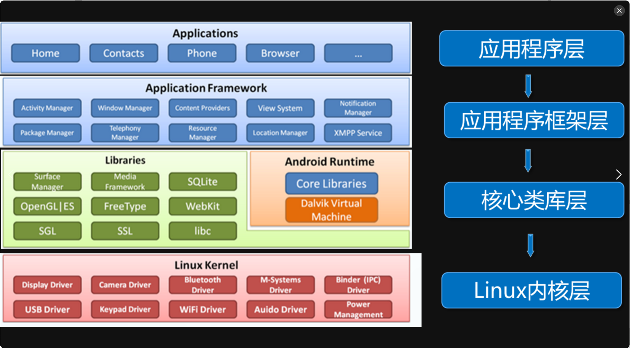
Android体系结构⭐️
Androdi采用分层设计,一共四层,从高到低依次是:应用程序层,应用程序框架层,核心类库,Linux内核层
-
应用程序层(Applications)
核心应用程序集合,简单而言就是我们使用的各种手机App程序
-
应用程序框架层(Application FrameWork)
主要提供了构建应用程序所需要的各种API,例如Activity Manager活动管理器,应用程序依靠这些API完成各种功能
-
核心类库
包括了系统库(例如 C/C++提供的对浏览器内核的支持)和安卓运行环境/安卓运行时库(允许使用Java和Kotlin等语言进行安卓开发 ; Dalvik虚拟机允许各个应用程序执行的时候环境隔离(类比Docker容器化技术做环境隔离))
-
Linux内核层
为安卓提供了各种硬件的驱动,例如蓝牙驱动,显示驱动,音频驱动,照相机驱动等等
四层理解记忆:
手机我们最顶层的就是我们直接打开使用的App即应用程序层
程序肯定是跑在框架上,所以接下来就是应用程序框架层,所谓框架无非就是封装好了很多类库方便开发使用,所以其功能就是提供API,其底层是核心类库所以下一层他也就是核心类库
核心类库见名知意,系统库和运行时库
最后由于安卓是基于Linux开发的,底层绝对是Linux,所以最下面就是Linux内核层,已经是最下面的一层了,必须和硬件挂钩了,硬件的使用就需要各种驱动(电脑连接U
盘,鼠标啥的都需要对应的驱动,所以有硬件就得有驱动),所以最后一层的功能也就是提供各种驱动
结构图如下所示
Dalvik虚拟机(了解 ,课本就一两行,考了我吃)
创建一个虚拟环境,分别运行各个程序,确保程序之间的隔离性和安全性。
安卓中的应用程序实际上就是一个Java程序orKotlin程序,就会被编译成class字节码文件,Dalvik就会将每个字节码文件通过DX工具变为dex文件,也会将dex文件优化为odex文件
Android开发快速入门
目录结构和资源管理(感觉了解一下即可)
创建项目步骤不说了,感觉和考试无关,应该不至于会问你文件目录,本来目录也是可变的,不会问这么死的东西应该。这里主要是看一下安卓的简单运行和一个安卓项目的架构,方便后续的理解
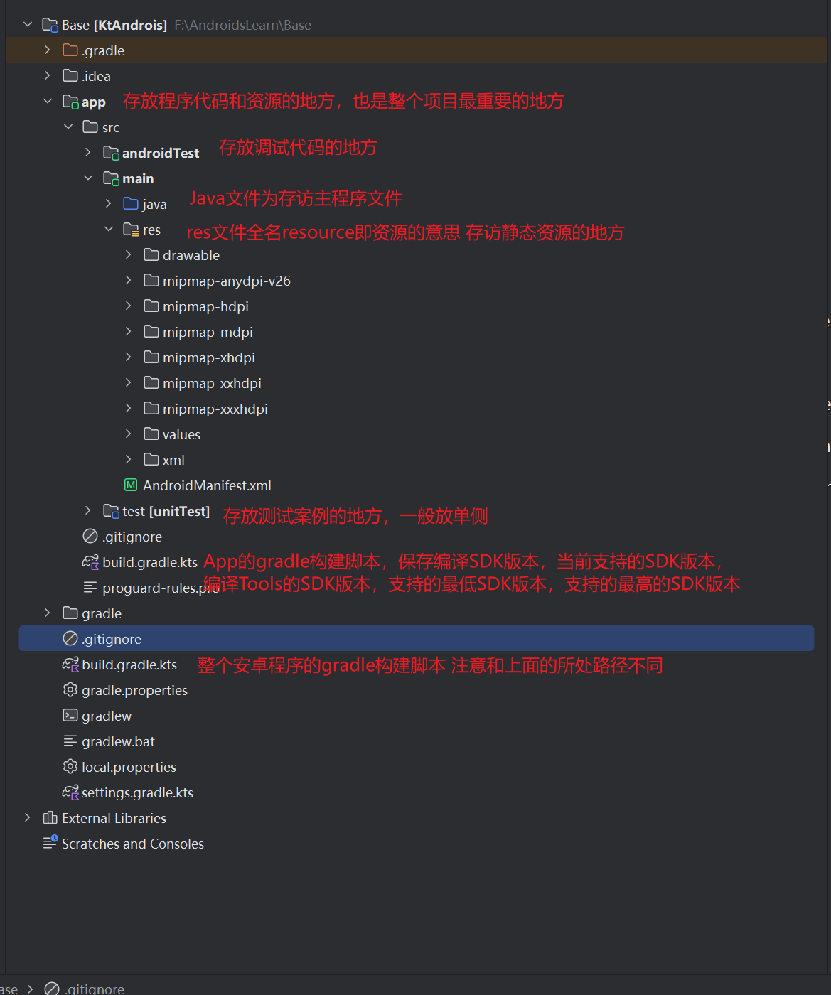
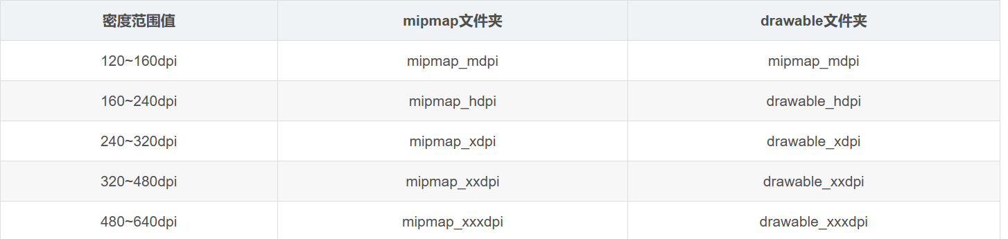
对于res目录下更加详细的划分是
图片资源
一般存放位置:res/drable 和 res/mipmap
-
drawable:存放应用程序接面中使用的图片资源
-
mipmap:存放应用程序的图标资源
无论是drawable还是mipmap中存放的资源,都是属于图片资源,根据设备屏幕密度的不同(可以理解为不同手机屏幕大小分辨率的不同),将drawable和mipmap都详细的分为了几个小文件目录从而区别度更高,进行更加细致的管理
在Android中调用调用图片资源的方式,分为了Java代码中调用和Xml布局文件中调用两种,样例代码如下
// 在Java代码中,需要在Acitivity中通过getResources().getDrawable()方法调用图片资源
//调用mipmap文件夹中资源文件
getResources().getDrawable(R.mipmap.your_image_name;
//调用以drawable开头的文件夹中的资源文件
getResources().getDrawable(R.drawable.your_image_name);
//在XML布局文件中通过如下方法进行调用
@mipmap/your_image_name //调用mipmap文件夹中的资源文件
@drawable/your_image_name //调用以drawable开头的文件夹中的资源文件
主题和样式资源
主题和样式的定义和作用都是差不多的,有点类似
什么叫主题/主题的定义:包含一种或者多种格式化属性的集合,在程序中调用主题资源可以改变窗体样式,作用于整个程序或者某个Activity,且影响是全局性的
主题定义位置:res/values下的styles.xml文件中,定义代码如下利用<style>标签
<resources>
<!-- name:用于指定主题名称 parent:用于指定继承的父主题 -->
  <style name="AppTheme" parent="Theme.AppCompat.Light.DarkActionBar">
        <item name="colorPrimary">@color/colorPrimary</item>
        <item name="colorPrimaryDark">@color/colorPrimaryDark</item>
        <item name="colorAccent">@color/colorAccent</item>
  </style>
</resources>
主题调用方式:一样可以通过Java代码和XML布局文件中两种调用方式
// 在Java中
setTheme(R.style.上面style标签中的name属性)
//XML布局文件中
<application
.....
android:theme = "@style/上面style标签中的name属性"
>
什么叫样式/样式的定义:设置一些View控件的宽度,高度,颜色,背景等等
定义位置:和主题一样,res/values 下的 styles.xml文件中,定义也是依靠<style>标签
<resources>
    <style name="btnStyle">
        <item name="android:layout_width">wrap_content</item>
        <item name="android:layout_height">match_parent</item>
        <item name="android:textSize">20sp</item>
    </style>
</resources>
样式调用方式
// Java中
setStyle()
// XML中
<Button
style="@style/btnStyle"
android:text="+"/>
需要注意的是,在定义主题/样式的时候,可以看到<style>标签是在<resources>标签下的,同一个<resources>标签下可以有多个<style>标签
布局资源
布局资源默认在 res/layout 目录下 , 一般是一个 .xml类型的文件,布局资源通常用于搭建程序中的各个界面
布局资源的调用方式如下
//Java中
setContentView(R.layout.布局资源文件名)
//XML布局文件中 一般搭配<include>标签
<include layout="@layout/布局文件资源名">
字符串资源
用于显示和管理界面中的文本信息,默认在 res/values 下的 strings.xml文件下,定义如下
<resources>
    <string name="app_anme">字符串</string>
</resources>
调用方式
// java中调用
getResources().getString(R.string.app_name);
// xml布局文件中
@string/app_name
颜色资源
当默认拥有的颜色资源不满足于需要的时候,就需要自定义颜色资源,一般放在res/color目录下的colors.xml文件下,定义规则如下,主要依靠<color>标签
  <resources>
       <color name="colorPrimary">#3F51B5</color>
  </resources>
调用方式如下
// Java中
getResources().getColor(R.colors.上述name属性)
// XML布局文件中
@color/上述name属性
尺寸资源
用于定义View控件相关的高度和宽度以及View之间的间隔,一般默认存放在res/values/dimens.xml文件中,定义格式如下
<resources>
    <dimen name="...">尺寸大小,例如16dp</dimen>
</ressources>
调用格式如下
// Java中调用
getRedsources().getDimension(R.dimen.上述name属性)
//XML布局文件中
@dimen/上述name属性
常见的尺寸大小单位:
-
px像素:每个像素对应屏幕上每一个点,720px X 1080x 也就是该屏幕横向有720个像素点,纵向有1080个像素点
-
dp设备独立像素:和dip意义相同,与屏幕密度无关的尺寸单位,高分辨率下独立像素比例就会变大;反之则变小
-
sp比例像素:一般用于处理文字大小,能跟随系统字体大小进行动态变化
-
in标准长度单位
-
pt磅:屏幕物理长度单位
-
mm毫米:屏幕物理长度单位
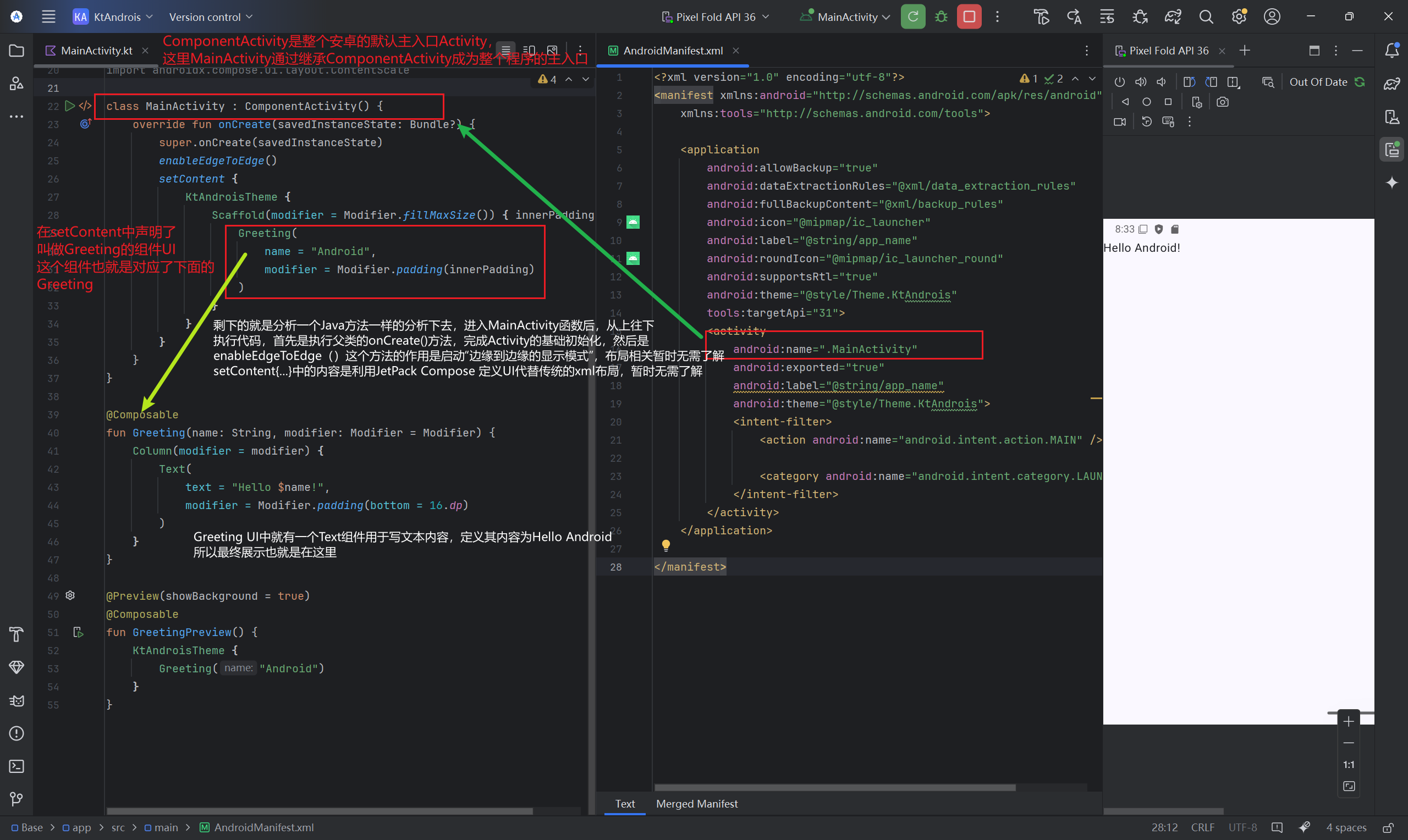
HelloWorld代码简单解释(可以不看)
MainActivity 类
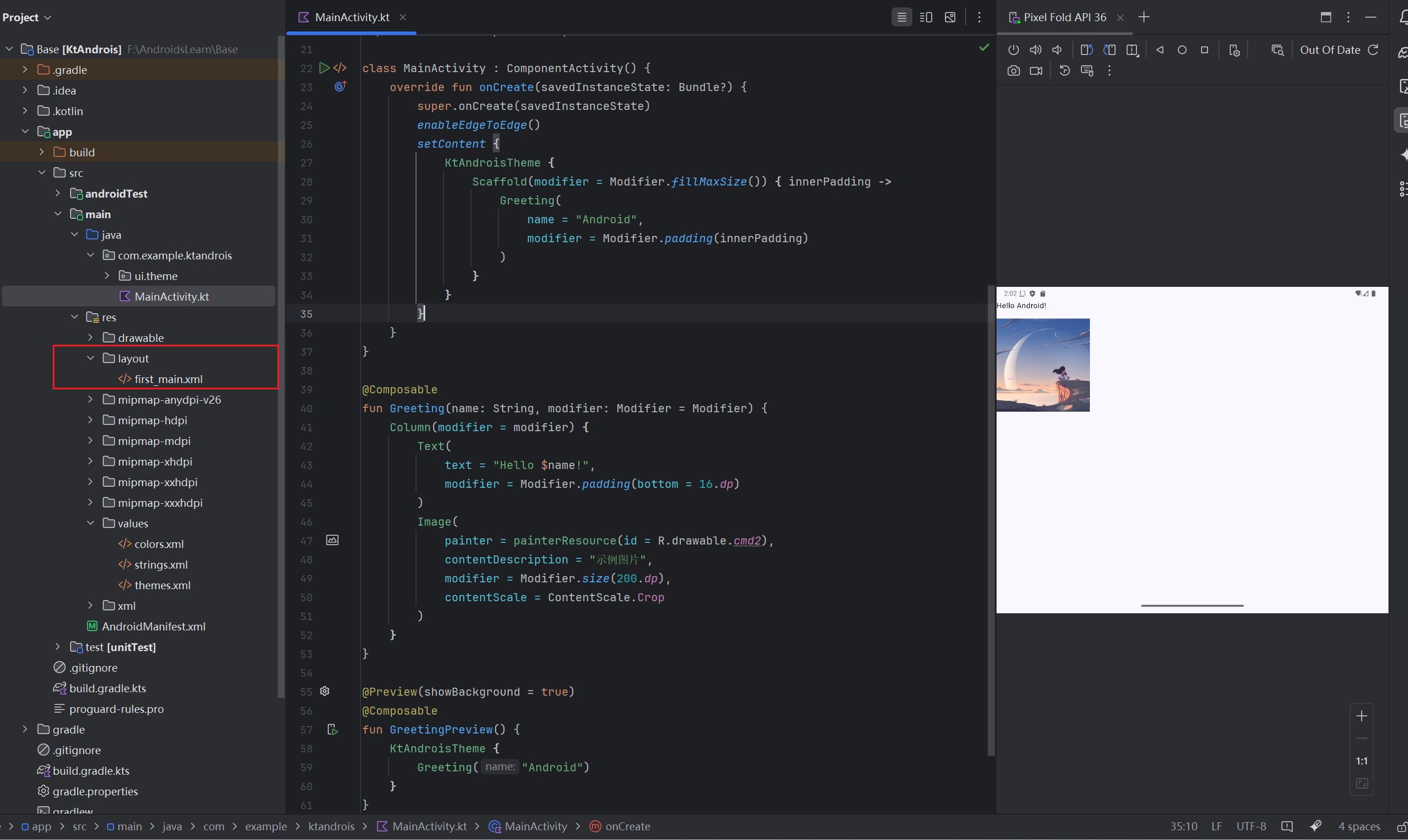
class MainActivity : ComponentActivity() {
    override fun onCreate(savedInstanceState: Bundle?) {
        super.onCreate(savedInstanceState)
        enableEdgeToEdge()
        setContent {
            KtAndroisTheme {
                Scaffold(modifier = Modifier.fillMaxSize()) { innerPadding ->
                    Greeting(
                        name = "Android",
                        modifier = Modifier.padding(innerPadding)
                    )
                }
            }
        }
    }
}
-
继承自
ComponentActivity:Android 应用的主入口 Activity。 -
onCreate方法:Activity 创建时调用,初始化 UI 和逻辑。-
super.onCreate:调用父类方法,完成 Activity 基础初始化。 -
enableEdgeToEdge():启用“边缘到边缘”显示模式,让内容延伸到状态栏和导航栏下方,需要配合系统栏颜色调整以实现沉浸式体验。 -
setContent { ... }:使用 Jetpack Compose 定义 UI,取代传统的 XML 布局。
-
Jetpack Compose UI 构建
主题 KtAndroisTheme
KtAndroisTheme {
    // UI 内容
}
-
作用:应用自定义主题(颜色、字体、形状等),通常通过 Android Studio 的模板生成,确保 UI 风格一致。
Scaffold布局
Scaffold(modifier = Modifier.fillMaxSize()) { innerPadding ->
    Greeting(...)
}
-
作用:Material Design 的脚手架组件,提供 App 的基础布局结构(如顶栏、底栏、悬浮按钮等)。
-
参数:
-
modifier = Modifier.fillMaxSize():填充整个屏幕。 -
innerPadding:自动处理系统栏(状态栏、导航栏)的间距,避免内容被遮挡。
-
Greeting组件
@Composable
fun Greeting(name: String, modifier: Modifier = Modifier) {
    Text(
        text = "Hello $name!",
        modifier = modifier
    )
}
-
@Composable注解:声明这是一个可组合函数,用于构建 UI。 -
功能:显示一个
Text组件,内容为Hello Android!。 -
参数:
-
name:动态文本内容。 -
modifier:通过innerPadding设置内边距,确保文本不被系统栏遮挡。
-
预览功能 GreetingPreview
@Preview(showBackground = true)
@Composable
fun GreetingPreview() {
    KtAndroisTheme {
        Greeting("Android")
    }
}
-
@Preview注解:在 Android Studio 的设计工具中预览 UI,无需运行应用。 -
showBackground = true:显示预览的背景,便于查看布局。 -
作用:预览
Greeting组件在主题下的显示效果。
程序启动流程
-
启动
MainActivity:Android 系统调用onCreate()。 -
启用边缘到边缘:
enableEdgeToEdge()让内容延伸到系统栏下方。 -
构建 Compose UI:通过
setContent定义 UI 内容。-
应用主题
KtAndroisTheme。 -
使用
Scaffold处理布局结构和间距。 -
显示
Greeting组件,展示文本 "Hello Android!"。
-
-
预览功能:
GreetingPreview仅在开发阶段用于设计工具中的实时预览。
总结
-
入口:
MainActivity是应用启动的入口,负责初始化 UI。 -
主题和布局:
KtAndroisTheme和Scaffold确保 UI 风格统一且适配系统栏。 -
组件化:
Greeting展示具体内容,通过 Composable 函数实现模块化。 -
开发效率:
@Preview提供实时预览,加速 UI 开发。
这段代码展示了现代 Android 开发中 Jetpack Compose 的核心用法,强调声明式 UI 和组件化设计。
Logcat(感觉了解即可)
Android的命令行工具,用于获取程序从启动到关闭的日志信息
Android常见的界面布局⭐️
在安卓程序中,界面由 布局+ 控件 组成
View控件
Android中所有的UI元素都是由View控件和ViewGroup容器构建的,对于一个安卓应用程序而言,整个页面作为一个ViewGroup包含了各种View控件和内嵌的ViewGroup容器,内嵌的ViewGroup容器中又可以继续包含和内嵌View控件和ViewGroup容器
整体结构类似如下结构图
Activity/Fragment
└── ViewGroup (根容器,如 ConstraintLayout/LinearLayout)
    ├── View 控件 (叶子节点,如 TextView)
    ├── View 控件 (叶子节点,如 Button)
    └── ViewGroup (嵌套容器,如 FrameLayout)
        ├── View 控件 (叶子节点,如 ImageView)
        └── ViewGroup (更深层嵌套,如 RecyclerView)
            ├── View 控件 (子项 1)
            └── View 控件 (子项 2)
界面布局方式编写
之前的内容就应该知道,Android中界面布局方式可以在XML布局文件中编写也可以在Java/Kotlin代码中编写,之所以可以在两边写,主要是为了进行代码隔离,使得程序结构更加清晰。
XML中编写
上面有提到,布局资源我们一般是写到了res/layout文件目录下,我们尝试来写一下
首先这是初始化代码的样子,就是新键项目的代码的基础上加一个图片的展示,没有任何影响,在左边目录中创建对应的布局文件first_main.xml文件
可能第一次打开对于安卓布局XML的展示方式编译器的默认方式是展示视图,即没有代码,纯可视化拖拽方式,找到右上角这三个进行切换即可进行代码操作
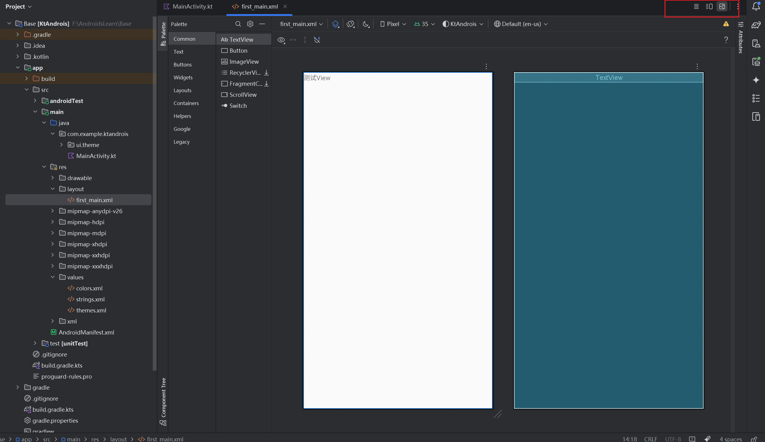
然后再刚刚创建的first文件中输入如下代码,代码来自书本案例,代码+注释如下
<!--
RelativeLayout标签代表相对布局,继承自ViewGroup
xmlns:android属性定义 Android 命名空间,用于访问系统属性(如 android:layout_width)
android:layout_width 属性代表该布局的宽度,match_parent代表填满整个父容器
android:layout_height 属性代表布局高度:同上,填满父容器。
如上所说的父容器,在这里因为绑定的是整个MainActivity,也就是整个屏幕
xmlns:tools 定义开发工具命名空间,用于设计时辅助(如 tools:context)
tools:context 设计时关联的 Activity(此处为 MainActivity),仅影响 Android Studio 的预览功能。
-->
<RelativeLayout xmlns:android="http://schemas.android.com/apk/res/android"
android:layout_width="match_parent"
android:layout_height="match_parent"
xmlns:tools="http://schemas.android.com/tools"
tools:context=".MainActivity">
<!--
子控件TextView,文本控件,继承自View
android:id 控件唯一标识符:@+id/textView 表示在代码中可通过findViewById(R.id.textView) 引用。
android:layout_width 控件宽度:match_parent表示填满父容器(即与 RelativeLayout 同宽)。
android:layout_height 控件高度:wrap_content 表示根据文本内容自动调整高度。
android:text 显示的文本内容(此处为 "测试View")。
-->
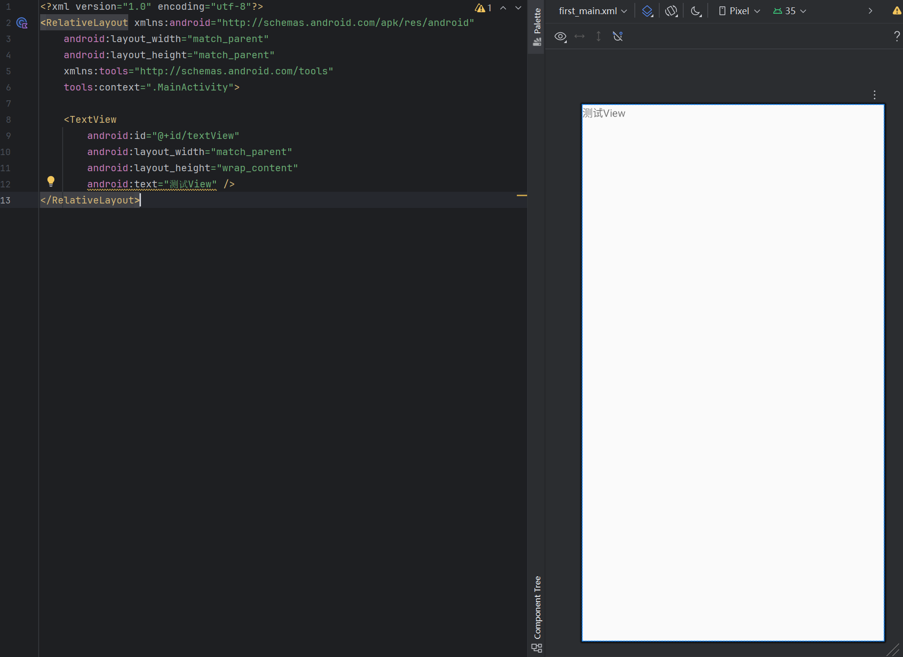
<TextView
android:id="@+id/textView"
android:layout_width="match_parent"
android:layout_height="wrap_content"
android:text="测试View" />
</RelativeLayout>
该布局的视图展示如下
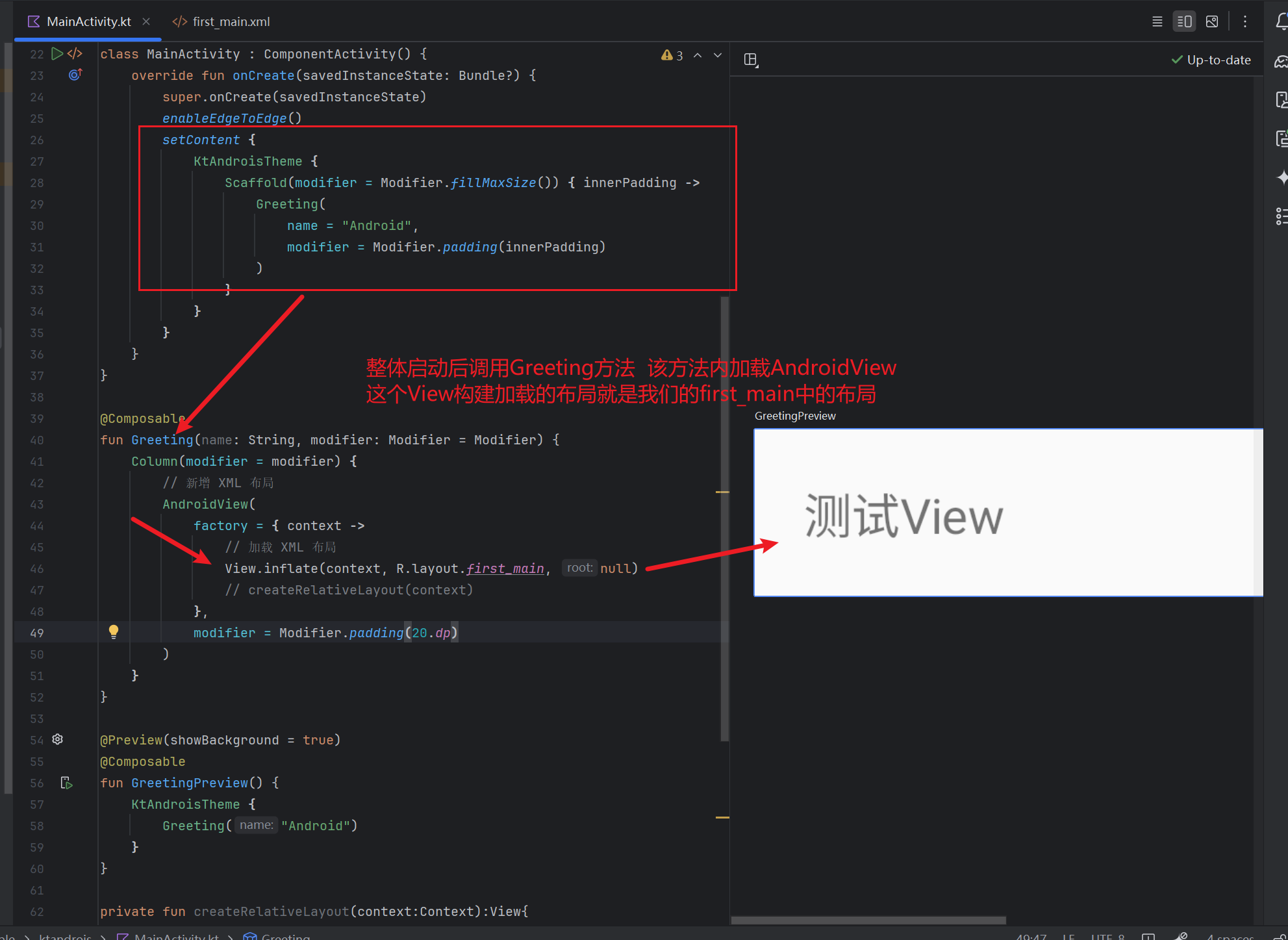
Java/Kotlin代码编写
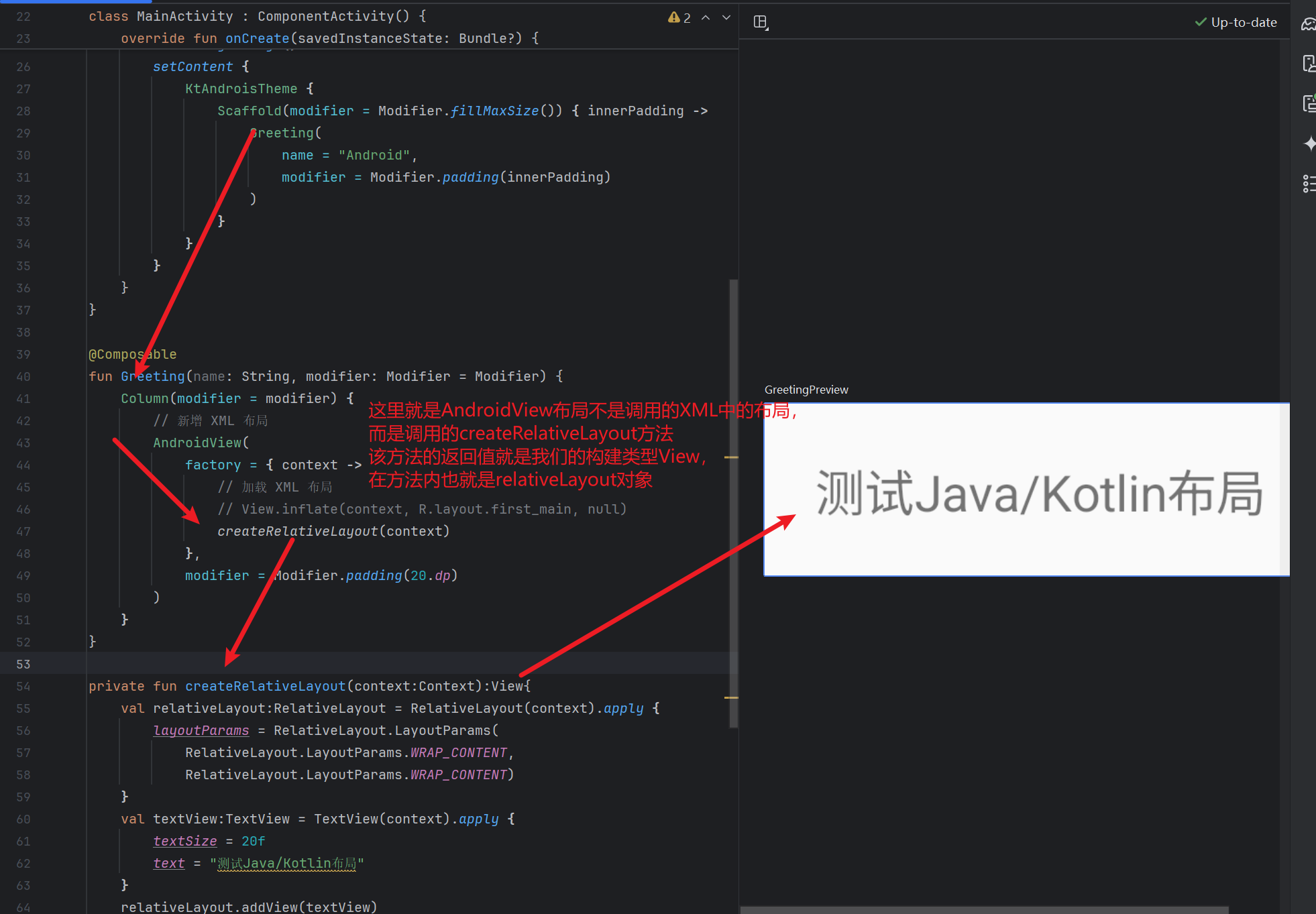
现在将上面的XML的代码转化为Java/Kotlin代码编写尝试,个人总结核心思路就是:任何布局和控件(例如上面的布局和控件RelativeLayout和TextView)都对应了一个对象,布局和控件的属性(例如上面的属性android:text)都对应的是成员变量
// kotlin代码如下
private fun createRelativeLayout(context:Context):View{
    val relativeLayout:RelativeLayout = RelativeLayout(context).apply {
        layoutParams = RelativeLayout.LayoutParams(
            RelativeLayout.LayoutParams.WRAP_CONTENT,
            RelativeLayout.LayoutParams.WRAP_CONTENT)
    }
    val textView:TextView = TextView(context).apply {
        textSize = 20f // 相当于xml中的android:textSize="20sp"
        text = "测试Java/Kotlin布局"
    }
    relativeLayout.addView(textView)
    return relativeLayout
}

// Java代码如下
private View createRelativeLayout(Context context) {
    // 1. 创建 RelativeLayout 并设置布局参数
    RelativeLayout relativeLayout = new RelativeLayout(context);
    RelativeLayout.LayoutParams layoutParams = new RelativeLayout.LayoutParams(
        RelativeLayout.LayoutParams.WRAP_CONTENT,
        RelativeLayout.LayoutParams.WRAP_CONTENT
    );
    relativeLayout.setLayoutParams(layoutParams);

    // 2. 创建 TextView 并设置属性
    TextView textView = new TextView(context);
    textView.setTextSize(20f); // 等价于 XML 的 android:textSize="20sp"
    textView.setText("测试Java/Kotlin布局");

    // 3. 将 TextView 添加到 RelativeLayout
    relativeLayout.addView(textView);

    return relativeLayout;
}
我们可以分别来看一下效果
布局通用属性⭐️
无他法,背诵走起!!(其实有他法,多写代码~)需要注意一点,android:layout_width和android:layout_height两个属性是必须的,其余的可以根据需要配置
| 属性名称 | 属性含义 |
|---|---|
| android:id |
设置布局的标识 用于设置该属性的唯一标识,在XML布局中通过“@+id/属性名称”的方式进行定义 当设置了android:id属性之后,在Java代码中可以通过findViewById(int id)方法进行获取对应的View控件 |
| android:layout_width |
设置布局的宽度,四种常用布局中这个属性值都是必须设置的 常见的属性有: 具体的数值:例如“20dp”表示布局宽度为20dp像素值 fill_parent:该布局的宽度和父容器(从根元素来讲就是整个屏幕)的宽度相同 match_parent:与fill_parent作用相同,也是通父容器,版本问题,Android 2.2版本之后推荐使用这个 wrap_content:表示该布局的宽度恰好能包裹他的内容 |
| android:layou_height |
设置布局的高度,四种常用布局中这个属性值都是必须设置的 常见的属性有: 具体的数值:例如“20dp”表示布局高度为20dp像素值 fill_parent:该布局的宽度和父容器(从根元素来讲就是整个屏幕)的高度相同 match_parent:与fill_parent作用相同,也是通父容器,版本问题,Android 2.2版本之后推荐使用这个 wrap_content:表示该布局的高度恰好能包裹他的内容 |
| android:background | 设置布局的背景,该属性的属性值可以是图片资源也可以是颜色资源 |
| android:layou_margin |
设置当前布局与屏幕边界,周围边界或控件的距离,属性值为具体的尺寸大小例如5dp 与该属性相类似的还有android:layout_marginTop(设置当前布局与周围布局/控件的上边界之间的距离) android:layout_marginBottom(设置当前布局与周围布局/控件的下边界之间的距离) android:layout_margtinLeft(设置当前布局与周围布局/控件的左边界之间的距离) android:layout_marginRight(设置当前布局与周围布局/控件的右边界之间的距离) |
| android:padding |
设置当前布局与该布局中控件的距离,其属性值是具体的尺寸大小例如5dp 与之类似的属性为android:paddingTop(设置布局内的控件和与该布局的顶部的距离) android:paddingBottom(设置布局内的控件和与该布局的底部的距离) android:paddingLeft(设置布局内的控件和与该布局的左边界的距离)
|
四大常用布局
四大常用布局是指:线性布局LinearLayout ;相对布局RelativeLayout ;表格布局TableLayout ; 帧布局FrameLayout
线性布局LinearLayout
线性布局中的子控件通常默认被指定为按照水平或者竖直方向进行排列
基本语法即<LinearLayout>标签如下
<LinearLayout xmlns:android="http://schemas.android.com/apk/res/android"
              属性:属性值>
........
</LinearLayout>
除了通用的布局属性之外,LinearLayout拥有的常用的特殊属性为android:orientation 和 android:layout_weight
| 属性名称 | 属性含义 |
|---|---|
| android:orientation | 设置布局中的控件的排列顺序 vertical表示控件从上到下依次进行竖直排列 horizontal表示控件从左往右依次水平排列 |
| android:layout_weight | 设置布局中控件的权重,属性值可以写int类型的数据 |
OK啊,话不多说,尝试一下,其实也还很简单和有意思的,主打一个各种控件和布局组合搭配,有种设计师的感觉,前端童鞋应该回觉得还是蛮亲切的
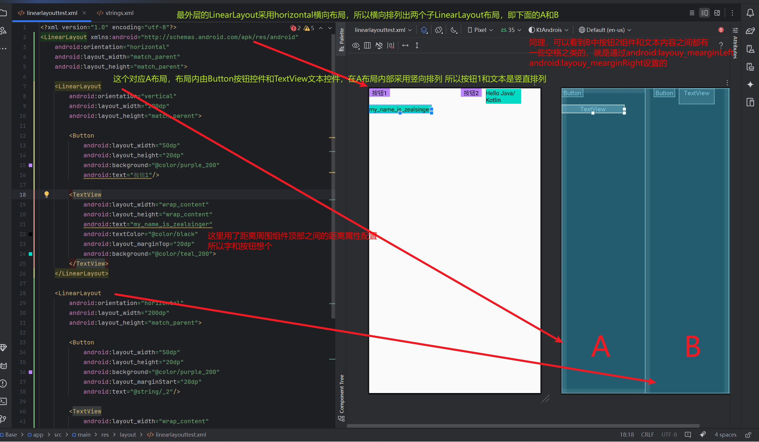
<LinearLayout xmlns:android="http://schemas.android.com/apk/res/android"
android:orientation="horizontal"
android:layout_width="match_parent"
android:layout_height="match_parent">
<LinearLayout
android:orientation="vertical"
android:layout_width="200dp"
android:layout_height="match_parent">
<Button
android:layout_width="50dp"
android:layout_height="20dp"
android:background="@color/purple_200"
android:text="按钮1"/>
<TextView
android:layout_width="wrap_content"
android:layout_height="wrap_content"
android:text="my_name_is_zealsinger"
android:textColor="@color/black"
android:layout_marginTop="20dp"
android:background="@color/teal_200">
</TextView>
</LinearLayout>
<LinearLayout
android:orientation="horizontal"
android:layout_width="200dp"
android:layout_height="match_parent">
<Button
android:layout_width="50dp"
android:layout_height="20dp"
android:background="@color/purple_200"
android:layout_marginStart="20dp"
android:text="@string/_2"/>
<!--
android:layout_marginStart="10dp"
android:layout_marginEnd="35dp"
分别是之对于该组件的起始位置和终止位置之间的隔离
对于TextView的起始位置即左边界其实就是 所在LinearLayout组件的左边界-Button的宽度
其终止位置默认为左边界+该组件的宽度,
如果限定该终止位置边界,可能会导致文本内的文字自动换行
-->
<TextView
android:layout_width="wrap_content"
android:layout_height="wrap_content"
android:text="@string/hello_java_kotlin"
android:layout_marginStart="10dp"
android:layout_marginEnd="35dp"
android:textColor="@color/black"
android:background="@color/teal_200">
</TextView>
</LinearLayout>
</LinearLayout>
相对布局RelativeLayout
相对布局是通过相对定位的方式,指定子控件的位置,常常以父容器或者其他容器作为参照物进行定位确认,相对而言自然复杂一些
基本语法即<RelativeLayout>标签如下
<RelativeLayout xmlns:android="http://schemas.android.com/apk/res/android" >
</RelativeLayout>
相对布局特有的一些属性配置
| 属性名称 | 功能描述 |
|---|---|
android:layout_centerInParent |
设置当前控件位于父布局的中央位置 |
android:layout_centerVertical |
设置当前控件位于父布局的垂直居中位置 |
android:layout_centerHorizontal |
设置当前控件位于父控件的水平居中位置 |
android:layout_above |
设置当前控件位于某控件上方 |
android:layout_below |
设置当前控件位于某控件下方 |
android:layout_toLeftOf |
设置当前控件位于某控件左侧 |
android:layout_toRightOf |
设置当前控件位于某控件右侧 |
android:layout_alignParentTop |
设置当前控件是否与父控件顶端对齐 |
android:layout_alignParentLeft |
设置当前控件是否与父控件左对齐 |
android:layout_alignParentRight |
设置当前控件是否与父控件右对齐 |
android:layout_alignParentBottom |
设置当前控件是否与父控件底端对齐 |
android:layout_alignTop |
设置当前控件的上边界与某控件的上边界对齐 |
android:layout_alignBottom |
设置当前控件的下边界与某控件的下边界对齐 |
android:layout_alignLeft |
设置当前控件的左边界与某控件的左边界对齐 |
android:layout_alignRight |
设置当前控件的右边界与某控件的右边界对齐 |
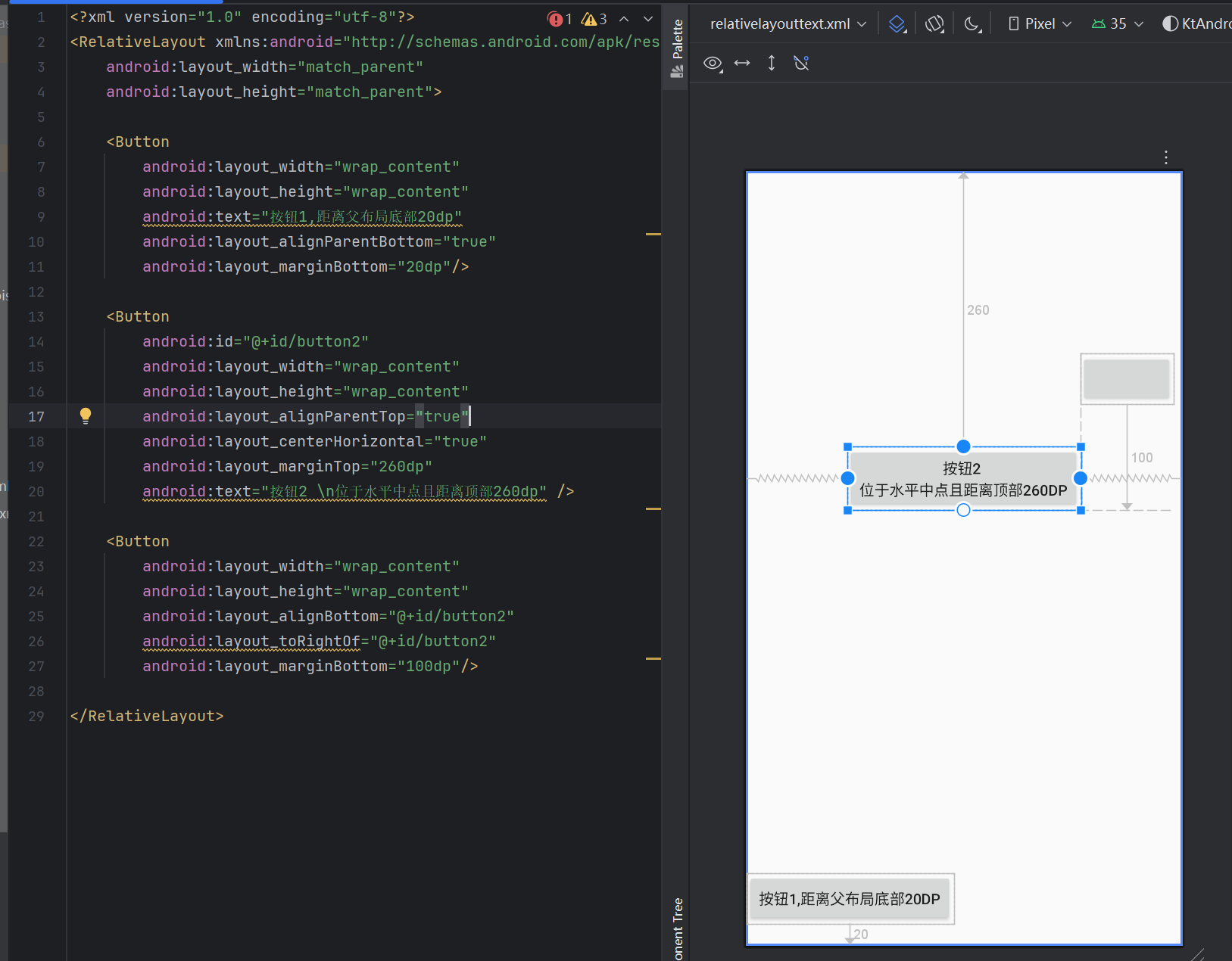
代码练习,设计书本图2-4的布局,代码和注解如下
<!--最外层布局采用RelativeLayout相对布局-->
<RelativeLayout xmlns:android="http://schemas.android.com/apk/res/android"
android:layout_width="match_parent"
android:layout_height="match_parent">
<!--依次定义三个按钮-->
<!--
第一个按钮 距离父布局底部20dp
首先利用layout_alignParentBottom让该控件和父布局底部对齐
然后加上layout_marginBottom控制间距为20dp
-->
<Button
android:layout_width="wrap_content"
android:layout_height="wrap_content"
android:text="按钮1,距离父布局底部20dp"
android:layout_alignParentBottom="true"
android:layout_marginBottom="20dp"/>
<!--
第二个按钮 要求在水平中间距离顶部260dp
因为默认顶部就是对齐的
所以可以先layout_centerHorizontal水平置中
然后layout_marginTop260dp
-->
<Button
android:id="@+id/button2"
android:layout_width="wrap_content"
android:layout_height="wrap_content"
android:layout_alignParentTop="true"
android:layout_centerHorizontal="true"
android:layout_marginTop="260dp"
android:text="按钮2 \n位于水平中点且距离顶部260dp" />
<!--
第三个按钮 和第二个按钮底部对齐且距离底部100dp
首先利用layout_alignBottom和button2底部对齐
然后利用layout_toRightOf调整位置到button的右边
最后利用layout_marginBottom距离底部100dp
-->
<Button
android:layout_width="wrap_content"
android:layout_height="wrap_content"
android:layout_toRightOf="@+id/button2"
android:layout_alignBottom="@+id/button2"
android:layout_marginBottom="100dp"/>
</RelativeLayout>
表格布局TableLayout
表格布局采用了行列式的形式管理内部的控件和子布局,不需要声明多少行和多少列,通过添加<TableRow>子控件来决定表格的行数,在<TableRow>布局中添加控件来控制表格的列数,基本格式如下
<TableLayout xmlns:android="http://schemas.android.com/apk/res/android"
             属性=属性值>
    <TableRow
        .....
        />
    .....
</TableLayout>
需要知道的是,TableLayout是LinearLayout的子类,也就是说除了通用属性的可以用,之前提到过的LinearLayout的属性也可以使用,还有自己的特有属性也可以用
| 属性名称 | 属性描述 |
|---|---|
| android:stretchColumns | 设置可拉伸的列 例如android:stretchColums="0"表示第一列可拉伸 |
| android:shrinkColumns | 设置可收缩的列 例如android:shrinkColumns="1,2"表示第二列和第三列可收缩 |
| android:collapseColumns | 设置可隐藏的列 例如android:collapseColumns='"0"表示第一列可以隐藏 |
对于TableLayout内部的控件,通常会用到如下两个属性
| 属性名称 | 属性描述 |
|---|---|
| android:layout_column |
设置该控件显示的位置 例如android:layout_column="1"表示在第二个位置中显示 |
| android:layout_span | 设置该控件占用几列,默认占用1列 |
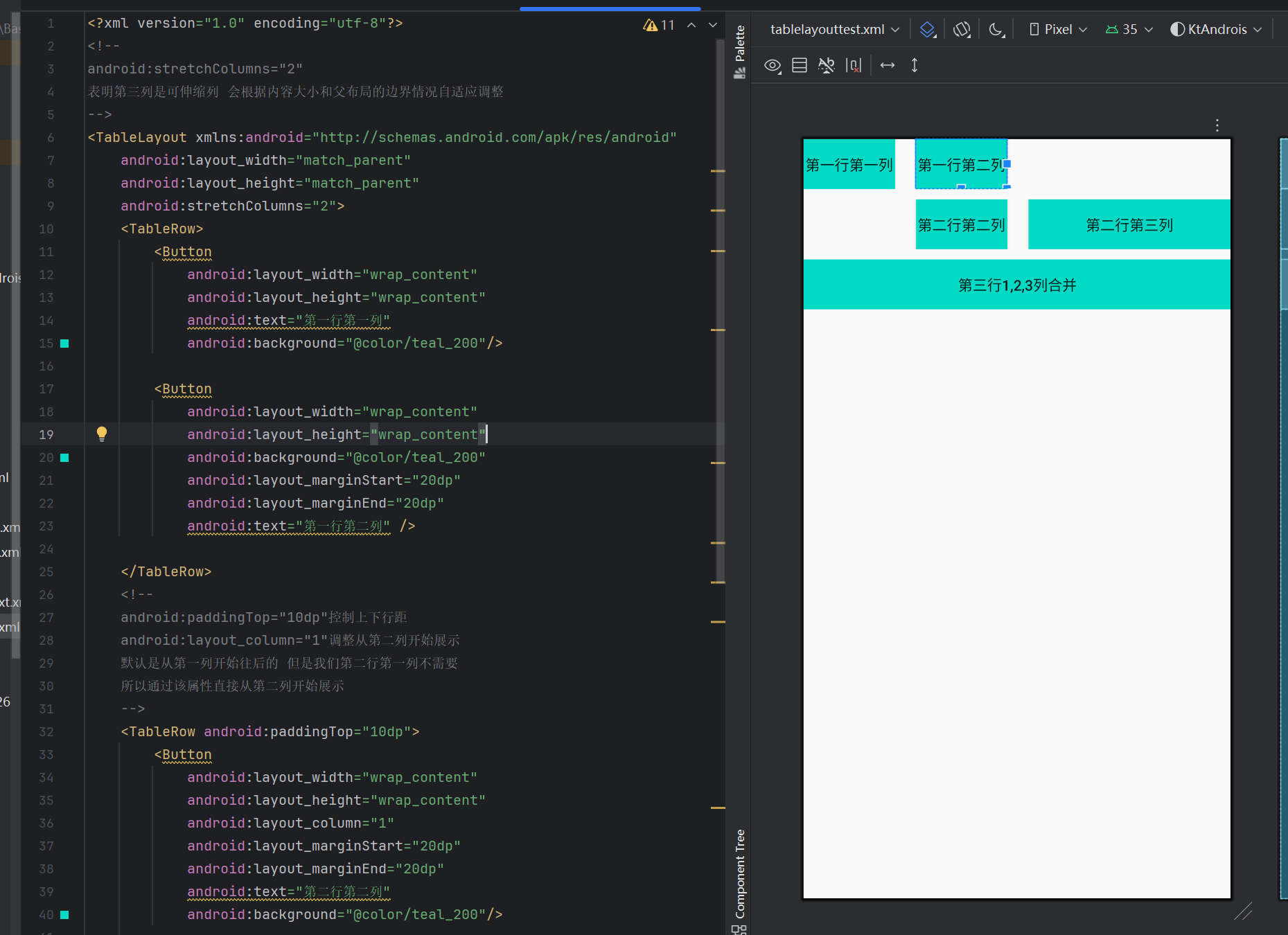
代码练习,对应书本图2-6,稍微不同,为了展示使用更多的属性进行了修改
<!--
android:stretchColumns="2"
表明第三列是可伸缩列 会根据内容大小和父布局的边界情况自适应调整
-->
<TableLayout xmlns:android="http://schemas.android.com/apk/res/android"
android:layout_width="match_parent"
android:layout_height="match_parent"
android:stretchColumns="2">
<TableRow>
<Button
android:layout_width="wrap_content"
android:layout_height="wrap_content"
android:text="第一行第一列"
android:background="@color/teal_200"/>
<Button
android:layout_width="wrap_content"
android:layout_height="wrap_content"
android:background="@color/teal_200"
android:layout_marginStart="20dp"
android:layout_marginEnd="20dp"
android:text="第一行第二列" />
</TableRow>
<!--
android:paddingTop="10dp"控制上下行距
android:layout_column="1"调整从第二列开始展示
默认是从第一列开始往后的 但是我们第二行第一列不需要
所以通过该属性直接从第二列开始展示
-->
<TableRow android:paddingTop="10dp">
<Button
android:layout_width="wrap_content"
android:layout_height="wrap_content"
android:layout_column="1"
android:layout_marginStart="20dp"
android:layout_marginEnd="20dp"
android:text="第二行第二列"
android:background="@color/teal_200"/>
<Button
android:layout_width="wrap_content"
android:layout_height="wrap_content"
android:text="第二行第三列"
android:background="@color/teal_200"/>
</TableRow>
<!--
一般默认占用一列
android:layout_span="3"设置占用三列
即三列合一的效果
-->
<TableRow android:paddingTop="10dp">
<Button
android:layout_width="wrap_content"
android:layout_height="wrap_content"
android:layout_span="3"
android:text="第三行1,2,3列合并"
android:background="@color/teal_200"/>
</TableRow>
</TableLayout>
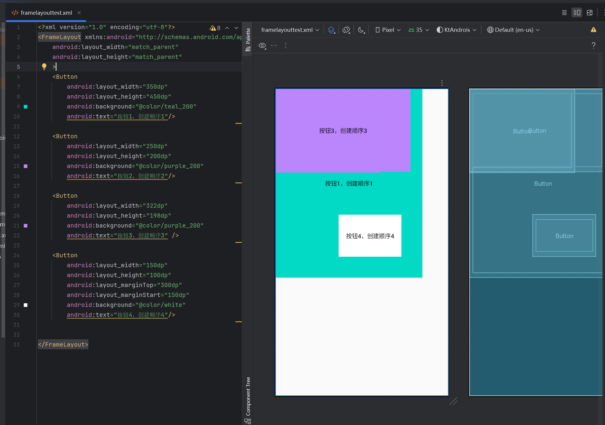
帧布局FrameLayout
帧布局用于在屏幕上创建一块空白区间,添加到该区域的控件会进行叠放,每个子控件占用一帧,默认和布局左上角进行对齐
基本语法格式为
<FrameLayout xmlns:android="http://schemas.android.com/apk/res/android"
             属性=属性名
             ..........
             >

</FrameLayout>
帧布局常用的属性如下
| 属性名称 | 属性描述 |
|---|---|
| android:foreground | 设置FrameLayout容器的前景图像(总显示在所有子控件之上 可以理解为设置置顶图像) |
| android:foregroundGravity | 设置前景图像的位置 |
代码练习,可以看到3把2给覆盖了
<FrameLayout xmlns:android="http://schemas.android.com/apk/res/android"
android:layout_width="match_parent"
android:layout_height="match_parent"
>
<Button
android:layout_width="350dp"
android:layout_height="450dp"
android:background="@color/teal_200"
android:text="按钮1,创建顺序1"/>
<Button
android:layout_width="250dp"
android:layout_height="200dp"
android:background="@color/purple_200"
android:text="按钮2,创建顺序2"/>
<Button
android:layout_width="322dp"
android:layout_height="198dp"
android:background="@color/purple_200"
android:text="按钮3,创建顺序3" />
<Button
android:layout_width="150dp"
android:layout_height="100dp"
android:layout_marginTop="300dp"
android:layout_marginStart="150dp"
android:background="@color/white"
android:text="按钮4,创建顺序4"/>
</FrameLayout>
文章标题:安卓速通(其实是期末复习~)(第一章+第二章)
文章链接:https://zealsinger.xyz/?post=8
本站所有文章除特别声明外,均采用 CC BY-NC-SA 4.0 许可协议,转载请注明来自ZealSinger !
如果觉得文章对您有用,请随意打赏。
您的支持是我们继续创作的动力!

微信扫一扫

支付宝扫一扫